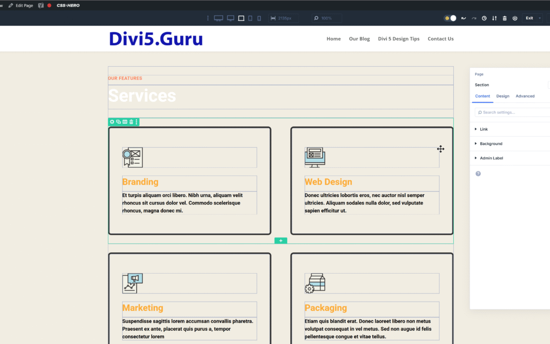
Table of Contents
- Understanding CSS Grid
- The Evolution of Divi: From Custom CSS to Grid Layouts
- Getting Started with Divi 5
- Creating Your First Grid Layout
- Exploring Pre-Built Grid Templates
- Advanced Grid Options for Experts
- Responsive Design with CSS Grid
- Practical Applications of CSS Grid
- Tips for Optimizing Your Grid Layouts
- Common Challenges and Solutions
- Future Developments in Divi 5
- Conclusion
Understanding CSS Grid
CSS Grid is a powerful layout system that allows web designers to create complex, responsive layouts with ease. Unlike traditional methods that rely heavily on floats and positioning, CSS Grid provides a two-dimensional grid-based approach. This means you can control both rows and columns simultaneously, making it easier to design intricate layouts without needing excessive custom CSS.
Key Features of CSS Grid
- Two-Dimensional Layouts: Control both horizontal and vertical alignment.
- Responsive Design: Automatically adjust layouts based on screen size.
- Simplified Code: Reduce the amount of CSS needed for complex layouts.
By leveraging CSS Grid, designers can create visually stunning websites that are not only functional but also maintain a consistent look across different devices.
The Evolution of Divi: From Custom CSS to Grid Layouts
Historically, creating custom layouts in Divi required a significant amount of custom CSS. Users often found themselves writing extensive code to achieve the desired look, which could be time-consuming and prone to errors. With the release of Divi 5, Elegant Themes has introduced a more intuitive way to build layouts using CSS Grid.
Comparison: Old vs. New
| Feature | Old Method (Custom CSS) | New Method (CSS Grid) |
|---|---|---|
| Complexity | High | Low |
| Learning Curve | Steep | Gentle |
| Responsiveness | Manual adjustments | Automatic |
| Code Maintenance | Difficult | Simplified |
The transition to CSS Grid not only simplifies the design process but also empowers users to create more dynamic and responsive layouts without the hassle of extensive coding.
Getting Started with Divi 5
To begin using CSS Grid in Divi 5, you first need to ensure that you have the latest version of the Divi theme installed. Once you have that set up, follow these steps to get started:
- Create a New Page: In your WordPress dashboard, navigate to Pages > Add New.
- Enable Divi Builder: Click on the “Enable Divi Builder” button to start designing.
- Select a Layout: Choose to build from scratch or use a pre-made layout.
Setting Up Your Workspace
Once you are in the Divi Builder, take a moment to familiarize yourself with the interface. The new grid options will be available in the row settings, enabling you to define your grid layout easily.
Creating Your First Grid Layout
Now that you have your workspace set up, it’s time to create your first grid layout. Here’s how to do it:
- Add a New Row: Click on the “+” icon to add a new row.
- Select Grid Layout: In the row settings, choose the “Grid” option.
- Define Columns: Specify the number of columns you want in your grid.
Example: Creating a Simple 3-Column Grid
To create a simple three-column grid, follow these steps:
- Set the number of columns to 3.
- Adjust the gutter width to control the spacing between columns.
- Add your desired modules (text, images, buttons) into each column.
This straightforward approach allows you to build a grid layout quickly, making it accessible even for beginners.
Exploring Pre-Built Grid Templates
One of the standout features of Divi 5 is the availability of pre-built grid templates. These templates are designed to help users get started quickly without needing to create layouts from scratch.
Benefits of Using Grid Templates
- Time-Saving: Quickly implement complex layouts.
- Customization: Easily modify templates to fit your brand.
- Variety: Access a wide range of designs for different purposes.
To use a grid template, simply navigate to the template library within the Divi Builder, select a grid layout, and apply it to your page. You can then customize the content to suit your needs.
Advanced Grid Options for Experts
For those who are more experienced with CSS Grid, Divi 5 offers advanced options that allow for greater customization and control over your layouts.
Customizing Grid Properties
- Grid Template Columns: Define specific column widths using percentages or fixed values.
- Grid Auto Rows: Control the height of rows based on content.
- Offset Editing: Create unique layouts by offsetting specific grid items.
These advanced features enable seasoned designers to push the boundaries of what’s possible with Divi, creating truly unique layouts that stand out.
Responsive Design with CSS Grid
One of the most significant advantages of using CSS Grid is its inherent responsiveness. With Divi 5, you can easily adjust your grid layouts for different screen sizes.
How to Optimize for Mobile
- Use Media Queries: Adjust grid properties based on device size.
- Change Column Count: For smaller screens, reduce the number of columns to ensure readability.
- Test Across Devices: Always preview your designs on various devices to ensure a seamless experience.
By implementing these strategies, you can ensure that your website looks great on any device, enhancing user experience and engagement.
Practical Applications of CSS Grid
CSS Grid can be applied in various scenarios to enhance your website’s design. Here are some practical applications:
1. Creating Call-to-Action Sections
Group your CTAs into a grid layout to draw attention and encourage user interaction.
2. Designing Testimonial Sections
Use grid layouts to display customer testimonials in a visually appealing manner, ensuring each testimonial is given equal prominence.
3. Showcasing Product Listings
For e-commerce sites, CSS Grid can help organize product listings into a clean, structured format that enhances the shopping experience.
Tips for Optimizing Your Grid Layouts
To get the most out of your CSS Grid layouts in Divi 5, consider the following tips:
- Keep It Simple: Avoid overcrowding your grid with too many elements.
- Use Consistent Spacing: Maintain uniform spacing between grid items for a polished look.
- Leverage Visual Hierarchy: Use size and color to guide users’ attention to important elements.
By following these tips, you can create grid layouts that are not only functional but also visually appealing.
Common Challenges and Solutions
While CSS Grid is a powerful tool, users may encounter challenges when implementing it. Here are some common issues and their solutions:
Challenge: Items Not Aligning Properly
Solution: Check your grid settings to ensure that the correct number of columns and rows are defined. Adjust the alignment properties as needed.
Challenge: Responsiveness Issues
Solution: Utilize media queries to adjust your grid layout for different screen sizes. Test your design on various devices to ensure compatibility.
Future Developments in Divi 5
As Divi 5 continues to evolve, users can expect even more features and enhancements related to CSS Grid. Future updates may include:
- Enhanced Flexbox Integration: Allowing for more complex layouts.
- Additional Pre-Built Templates: Expanding the library of grid templates for quicker implementation.
- Improved Customization Options: Giving users even more control over their designs.
Staying updated with these developments will ensure that you can leverage the full potential of Divi 5 in your web design projects.
Conclusion
The introduction of CSS Grid in Divi 5 marks a significant advancement in web design capabilities. By simplifying the layout process and providing powerful tools for customization, Divi 5 empowers users to create stunning, responsive websites with ease. Whether you are a beginner or an experienced designer, mastering CSS Grid will enhance your workflow and elevate your design projects.
By following the steps outlined in this guide, you can harness the power of CSS Grid to create beautiful, functional layouts that engage your audience and enhance their experience on your website. Embrace the future of web design with Divi 5 and unlock new possibilities for your projects.
Feel free to reach out if you have any questions or need further assistance with your Divi 5 projects!
0 Comments