Creating a visually appealing and functional website can be a daunting task, especially for those who are not well-versed in web design. However, with the introduction of Divi 5 and its innovative Flexbox layout system, the process has become significantly more manageable. This guide will walk you through the ins and outs of Divi 5 Flexbox, providing you with the knowledge to enhance your website design using this powerful tool.
Understanding Divi 5 Flexbox
What is Flexbox?
Flexbox, short for “Flexible Box Layout,” is a CSS layout model that allows for the efficient arrangement of elements within a container. It provides a more intuitive way to design responsive layouts, making it easier to align and distribute space among items in a container, even when their size is unknown or dynamic. For a more thorough overview of CSS flexbox, consider reading the MDN documentation by Mozilla.
Why Use Flexbox in Divi 5?
The integration of Flexbox into Divi 5 offers several advantages:
- Responsive Design: Flexbox simplifies the creation of responsive layouts that adapt seamlessly to different screen sizes.
- Element Alignment: It allows for easy vertical and horizontal alignment of elements, enhancing the overall aesthetic of your website.
- Dynamic Layouts: Flexbox enables the creation of complex layouts without the need for extensive CSS coding, making it accessible for users of all skill levels.
Getting Started with Divi 5 Flexbox
Setting Up Your Environment
Before diving into Flexbox, ensure you have the latest version of Divi 5 installed. If you’re new to Divi, you can easily set it up by following these steps:
- Install Divi: Purchase and download the Divi theme from the Elegant Themes website.
- Activate the Theme: Upload the theme to your WordPress site and activate it.
- Explore the Builder: Familiarize yourself with the Divi Builder interface, which will be your primary tool for creating layouts.
Creating Your First Flexbox Layout
To create a layout using Flexbox in Divi 5, follow these steps:
- Add a New Section: Start by adding a new section to your page.
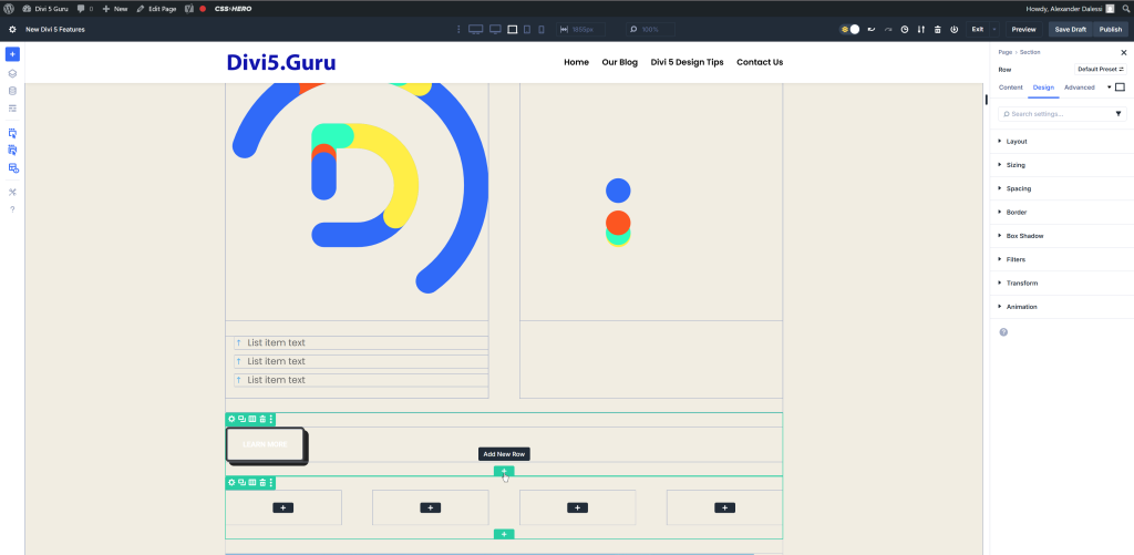
- Insert a Row: Choose a row structure that suits your design needs.
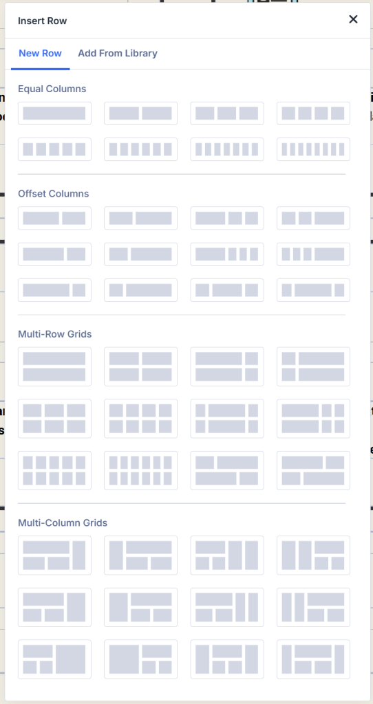
Compared to Divi 4, Divi 5 offers a variety of row configuration options.
- Enable Flexbox: In the row settings, navigate to the “Design” tab and enable Flexbox options.
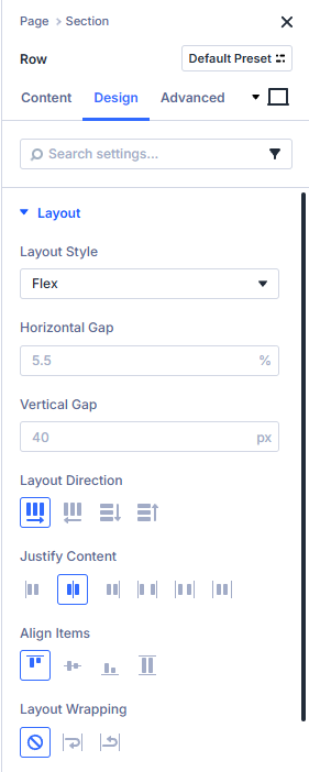
- Customize Your Layout: Adjust the flex properties such as direction, alignment, and wrapping to achieve your desired layout.
Exploring Flexbox Features
Flexbox Controls
Divi 5 offers a robust set of Flexbox controls that allow you to manipulate various aspects of your layout:
- Direction: Choose whether your items are laid out in a row or column.
- Justify Content: Control the alignment of items along the main axis (e.g., start, center, space-between).
- Align Items: Adjust the alignment of items along the cross axis (e.g., stretch, center, baseline).
- Flex Wrap: Decide whether items should wrap onto multiple lines or stay in a single line.
Responsive Design with Flexbox
One of the standout features of Flexbox is its ability to create responsive designs effortlessly. You can assign different flex properties at various breakpoints, ensuring your layout looks great on all devices. Here’s how to do it:
- Set Breakpoints: In the row settings, navigate to the “Advanced” tab and set breakpoints for different devices (desktop, tablet, mobile).
- Customize Layouts: Adjust the flex properties for each breakpoint to optimize the layout for different screen sizes.
Practical Applications of Divi 5 Flexbox
Creating Call-to-Action Sections
Call-to-action (CTA) sections are crucial for guiding users toward desired actions. With Flexbox, you can create visually appealing CTAs that stand out:
- Add a New Row: Insert a new row for your CTA.
- Insert Modules: Add text, buttons, and images as needed.
- Apply Flexbox Settings: Use Flexbox controls to center align your elements and adjust spacing for a polished look.
Designing Testimonial Sections
Testimonials can enhance credibility and trust. Here’s how to design a testimonial section using Flexbox:
- Create a New Row: Add a new row specifically for testimonials.
- Insert Testimonial Modules: Use the testimonial module to add customer feedback.
- Utilize Flexbox: Align testimonials in a grid format using Flexbox controls, ensuring they are evenly spaced and visually appealing.
Advanced Features of Divi 5 Flexbox
Nested Rows
Nested rows allow for even more complex layouts. You can create a row within a row, giving you the flexibility to design intricate structures. Here’s how to implement nested rows:
- Add a Row: Start with a standard row.
- Insert a Nested Row: Within that row, add another row.
- Customize Each Row: Apply different Flexbox settings to each row for unique layouts.
Custom Module Ordering
Flexbox allows you to change the order of modules without altering the HTML structure. This feature is particularly useful for responsive designs. To reorder modules:
- Access Row Settings: Click on the row containing your modules.
- Adjust Order: Use the Flexbox controls to change the order of modules as needed.
Tips for Maximizing Divi 5 Flexbox
Consistency is Key
When using Flexbox, strive for consistency in your design. Ensure that similar elements share the same styling and spacing to create a cohesive look across your website.
Test Across Devices
Always preview your designs on various devices to ensure they look great everywhere. Use Divi’s built-in responsive preview feature to check your layouts.
Leverage Presets
Divi allows you to save your Flexbox settings as presets. This feature can save you time when creating similar layouts across different pages.
Conclusion
Divi 5 Flexbox represents a significant advancement for web designers, providing exceptional flexibility and control over layouts. By mastering this sophisticated tool, individuals can develop visually striking and responsive websites that effectively engage users and facilitate conversion rates. Whether one is an experienced designer or a novice, Divi 5 Flexbox has the potential to enhance web design capabilities significantly.
For those seeking to improve their online presence, it would be prudent to consider collaborating with a professional web design service in Orange County. Such services can assist in harnessing the full potential of Divi 5 Flexbox to create a website that not only possesses an appealing aesthetic but also ranks favorably in search engine results.
Furthermore, if there is a desire to optimize the website further, exploring the SEO services available in Orange County through Website Promoters is advisable. Visit our website and fill out a form for a free consultation or call (855)-325-3774. This approach can enhance your site’s visibility and attract a greater number of visitors. With the right tools and strategies in place, your website can achieve considerable success in the digital landscape.
0 Comments