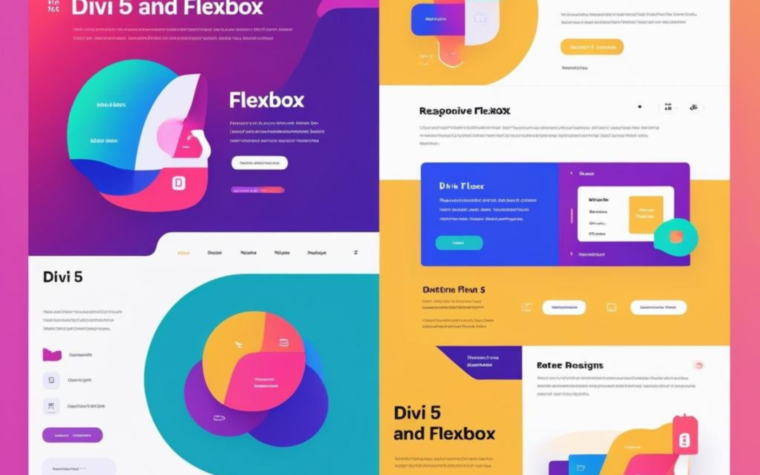
With the introduction of Divi 5 and its innovative Flexbox Layout System, the process of creating a visually appealing and functional website has become significantly more manageable. This blog post will walk you through the ins and outs of Flexbox in Divi 5, providing you with the knowledge to enhance your website design using this powerful tool.
Understanding Flexbox
Flexbox, short for Flexible Box Layout, is a CSS layout model that simplifies the arrangement of elements within a container. It enables dynamic resizing and alignment of items, making it a vital tool for modern web design. Unlike traditional layout methods that rely on floats or positioning, Flexbox provides a more intuitive approach to creating responsive designs.
Key Features of Flexbox
- Flex Container: The parent element that utilizes the
display: flexproperty, establishing a flex context for its children. - Flex Items: The direct children of the flex container, which can be manipulated using various flex properties. This is critical to understand that flex properties apply to child or descendant elements.
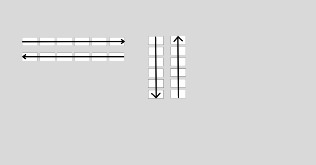
- Main and Cross Axes: Flexbox operates along a central axis (horizontal or vertical) and a perpendicular cross-axis, allowing for versatile layout options. By default, the main axis is horizontal and the cross-axis is vertical with the flex-direction going from left to right. To set the main and cross axes, use the flex-direction property.
flex-direction: row | row-reverse | column | column-reverse;
Flexbox in Divi 5: A Game Changer
Divi 5 has integrated Flexbox directly into its Visual Builder, allowing users to create complex, responsive layouts with ease. This integration replaces outdated layout systems and provides a more efficient way to manage design elements.
Advantages of Using Flexbox in Divi 5
- Intuitive Controls: Flexbox settings are user-friendly, enabling designers of all skill levels to create stunning layouts without writing code.
- Responsive Design: Flexbox makes it easy to create layouts that adapt seamlessly across various screen sizes, ensuring a polished look on desktops, tablets, and smartphones.
- Enhanced Performance: By streamlining the design process, Divi 5 reduces complexity and enhances site performance, resulting in faster load times.
Getting Started with Flexbox in Divi 5
To access Flexbox settings in Divi 5, follow these steps:
- Open the Visual Builder: Navigate to the page you want to edit and enable the Visual Builder.
- Add a New Row: Click on the “+” icon to add a new row to your layout.
- Access the Design Tab: Click on the settings icon for the row and navigate to the Design tab.
- Select Flexbox Settings: Under the Layout dropdown, you will find various Flexbox options to customize your layout.
Key Flexbox Settings in Divi 5
- Layout Style: Choose between Flex and Block. Flex allows for flexible arrangements, while Block treats elements as traditional block-level items.
- Horizontal and Vertical Gaps: Control the spacing between flex items using the Horizontal and Vertical Gap settings.
- Layout Direction: Determine the primary axis for item arrangement, with options for Row, Row Reverse, Column, and Column Reverse.
- Justify Content: Align flex items along the main axis using options like Start, Center, End, Space Between, Space Around, and Space Evenly.
- Align Items: Control the alignment of items along the cross axis, with options for Start, Center, End, and Stretch.
Practical Applications of Flexbox in Divi 5
Flexbox opens up a world of possibilities for web designers. Here are some practical applications to consider:
Creating Call-to-Action Sections
To create an effective call-to-action (CTA) section, group relevant elements such as a compelling headline, a persuasive subheading, and a vibrant button. By using Flexbox, you can easily align these elements for maximum impact.
Designing Testimonial Sections
Testimonials are crucial for building trust with your audience. Use Flexbox to create a visually appealing layout that showcases customer quotes, images, and names in a cohesive manner.
Building Grids and Galleries
Flexbox allows for the creation of dynamic grids and galleries. By adjusting the Layout Direction and Layout Wrapping settings, you can create stunning visual displays that adapt to different screen sizes.
Advanced Features of Flexbox in Divi 5
As you become more familiar with Flexbox, you’ll discover advanced features that can further enhance your design capabilities.
Nested Rows and Module Groups
Combining Nested Rows with Flexbox enables you to create intricate, multi-level layouts. For instance, you can have a row with columns that contain their own rows, allowing for sophisticated designs like layered content sections.
Customizable Responsive Breakpoints
Divi 5’s Flexbox system supports customizable responsive breakpoints, allowing you to adjust layouts for specific screen sizes. This feature ensures that your designs look great on all devices without the need for duplicating sections or writing custom CSS.
Integration with Other Divi Features
Flexbox works seamlessly with other Divi features, such as Module Groups and the upcoming Loop Builder. This integration allows for greater flexibility in managing and displaying dynamic content.
Tips for Maximizing Flexbox in Divi 5
To get the most out of Flexbox in Divi 5, consider the following tips:
- Experiment with Settings: Don’t hesitate to play around with different Flexbox settings to see how they affect your layout.
- Utilize Prebuilt Templates: Divi 5 offers prebuilt Flexbox templates that can serve as a starting point for your designs.
- Test Across Devices: Always preview your designs on various devices to ensure a consistent user experience.
- Stay Updated: Keep an eye on future updates to Divi 5, as new features and enhancements are continually being introduced.
Conclusion
Flexbox in Divi 5 revolutionizes the way users build responsive, dynamic layouts. By integrating powerful CSS Flexbox properties into the Visual Builder, Divi 5 allows users to create stunning, modern websites without writing code. From intuitive alignment and spacing controls to advanced features like Nested Rows and Module Groups, the Flexbox Layout System simplifies complex designs while ensuring perfectly responsive layouts that look great on all devices.
By mastering Flexbox, you equip yourself with the skills necessary to create visually appealing and functional websites that stand out in today’s competitive online landscape. Whether you’re a seasoned designer or just starting, Flexbox in Divi 5 can help you achieve your design goals with ease.